9 July 2026Admin
Understanding Color Theory in Graphic Design
Color is one of the most powerful tools in graphic design. It influences emotions, attracts attention, communicates messages, and shapes how people perceive a brand. Whether you're designing a logo, poster, website, social media post, or product packaging, understanding Color Theory can help you create visually appealing and effective designs.
What is Color Theory?
Color Theory is a set of principles that explains how colors interact with each other and how they affect human perception. It helps designers choose color combinations that are harmonious, balanced, and suitable for a specific purpose.
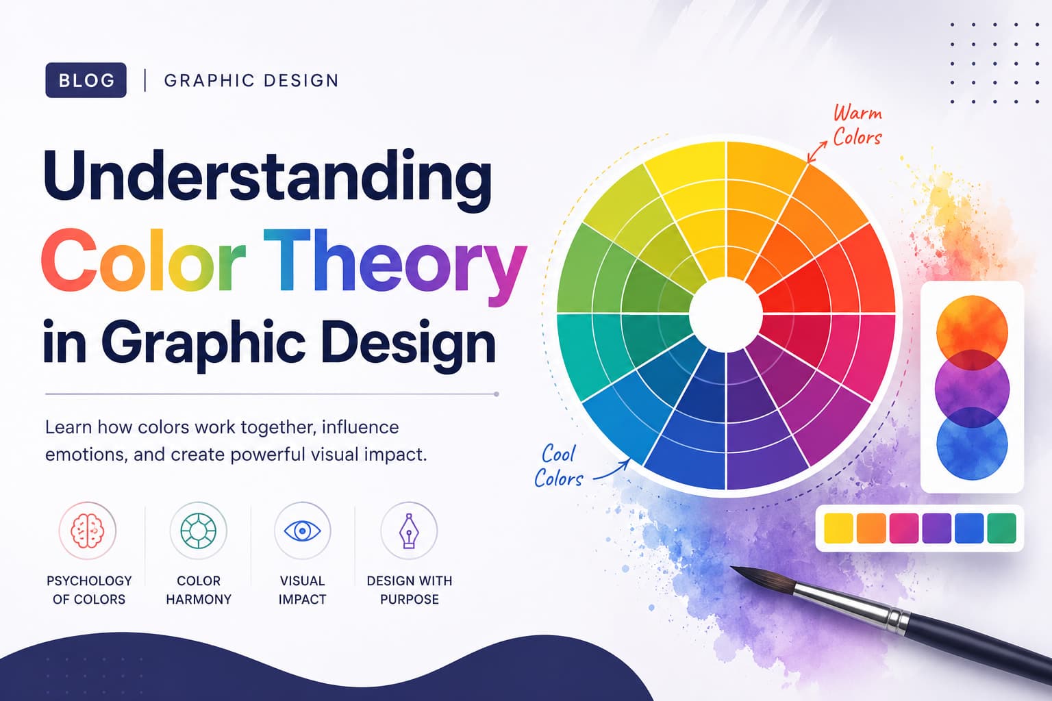
The foundation of color theory is the Color Wheel, which organizes colors into three main categories:
1. Primary Colors
- Red
- Blue
- Yellow
These colors cannot be created by mixing other colors together.
2. Secondary Colors
- Orange (Red + Yellow)
- Green (Blue + Yellow)
- Purple (Red + Blue)
3. Tertiary Colors
These are created by mixing a primary color with a neighboring secondary color, such as blue-green or red-orange.
Why Color Theory Matters in Graphic Design
1. Creates Emotional Impact
Different colors evoke different emotions:
- Red – Energy, passion, urgency
- Blue – Trust, stability, professionalism
- Green – Growth, nature, freshness
- Yellow – Optimism, happiness, attention
- Purple – Creativity, luxury, imagination
- Black – Elegance, power, sophistication
- White – Simplicity, cleanliness, purity
Choosing the right colors helps communicate the intended message instantly.
2. Strengthens Brand Identity
Brands often become recognizable through their colors. For example, many tech companies use blue to convey trust, while food brands often use red and yellow to stimulate appetite and excitement.
3. Improves Visual Hierarchy
Color can guide viewers through a design by highlighting important elements such as headlines, buttons, offers, or calls to action.
- Common Color Harmonies
1. Complementary Colors
Colors opposite each other on the color wheel, such as blue and orange. These combinations create strong contrast and grab attention.
2. Analogous Colors
Colors that sit next to each other on the color wheel, such as blue, blue-green, and green. They create a calm and harmonious look.
3. Triadic Colors
Three colors evenly spaced around the wheel, such as red, yellow, and blue. This creates a vibrant and balanced composition.
4. Monochromatic Colors
Different shades and tints of a single color. This approach creates a clean and sophisticated design.
5. Warm vs. Cool Colors
Warm Colors
- Red
- Orange
- Yellow
These colors feel energetic, exciting, and attention-grabbing. They are often used for promotions and call-to-action elements.
Cool Colors
- Blue
- Green
- Purple
These colors feel calm, trustworthy, and professional, making them popular for corporate and technology designs.
- Practical Tips for Designers
Using too many colors can make a design look messy. A good rule is to use 2–4 primary colors and a few supporting shades.
2. Consider Contrast
Ensure text is readable against the background. High contrast improves accessibility and user experience.
3. Understand Your Audience
Color preferences can vary by age, culture, and industry. Research your target audience before finalizing a color palette.
4. Test Across Devices
Colors may appear differently on phones, tablets, and monitors. Always preview your designs on multiple screens.
- Final Thoughts
Color Theory is more than just choosing attractive colors—it's about using color strategically to communicate, persuade, and create memorable designs. By understanding how colors work together and how they influence human emotions, designers can create visuals that are not only beautiful but also highly effective.
Whether you're designing a logo, a social media post, a brochure, or a website, mastering color theory will elevate your work and help your designs stand out in a crowded visual world.
Great design doesn't happen by accident. It happens when creativity is guided by principles—and color theory is one of the most important principles every graphic designer should master.