9 July 2026Admin
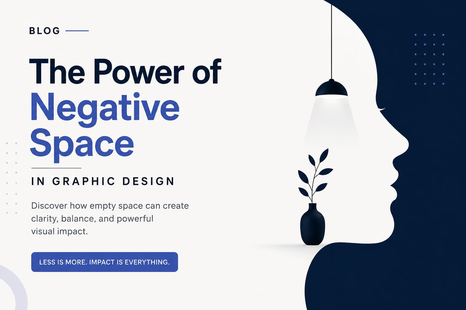
The Power of Negative Space in Graphic Design
When most people think about graphic design, they focus on the elements that are visible—logos, colors, typography, illustrations, and images. However, one of the most powerful design tools is something that isn't there at all: Negative Space.
Negative space, also known as white space, is the empty area surrounding and between design elements. It's not wasted space—it's an intentional design element that improves clarity, balance, and visual impact.
What is Negative Space?
Negative space is the empty or unoccupied area around objects in a design. It helps define shapes, creates breathing room, and guides the viewer's attention toward the most important information.
Think of it as the silence between musical notes. Without pauses, music becomes noise. Similarly, without negative space, a design becomes cluttered and overwhelming.
Why is Negative Space Important?
1. Improves Readability
Crowded layouts are difficult to read. Proper spacing between text, images, and sections makes content easier to understand and keeps readers engaged.
2. Creates Visual Balance
Negative space allows each design element to breathe. It prevents visual overload and creates a clean, professional appearance.
3. Directs Attention
Strategic empty space naturally draws the viewer's eyes toward key elements such as headlines, call-to-action buttons, logos, or product images.
4. Enhances Brand Perception
Luxury and premium brands often use generous negative space because it conveys elegance, sophistication, and confidence.
5. Encourages Creativity
Negative space can hide clever visual messages, making designs memorable and engaging.
Famous Examples of Negative Space
Some of the world's most recognizable logos use negative space brilliantly:
- The FedEx logo contains a hidden arrow between the "E" and "x," symbolizing speed and precision.
- The WWF panda uses negative space to form the animal with minimal shapes.
- The NBC logo creates a peacock using colorful shapes and the surrounding empty space.
These subtle details make the logos iconic without adding unnecessary complexity.
Where Can You Use Negative Space?
Negative space is useful in almost every design project, including:
- Logo Design
- Business Cards
- Posters
- Brochures
- Social Media Posts
- Website Layouts
- Product Packaging
- Advertisements
- Magazine Layouts
- T-shirt Graphics
Whether you're designing a wedding invitation or a corporate brochure, thoughtful spacing can significantly improve the final result.
Common Mistakes to Avoid
Many beginner designers try to fill every empty corner with graphics or text. This often leads to cluttered designs.
Avoid these mistakes:
- Using too many fonts or graphics
- Reducing margins to fit more content
- Placing elements too close together
- Ignoring alignment and spacing
- Overcrowding posters with unnecessary information
Remember: Just because space is empty doesn't mean it's unused.
Tips for Using Negative Space Effectively
- Keep sufficient margins around your content.
- Use consistent spacing throughout the design.
- Limit the number of visual elements.
- Let important objects stand alone.
- Review your layout from a distance to identify crowded areas.
- Prioritize clarity over decoration.
Final Thoughts
Negative space is one of the simplest yet most effective principles in graphic design. It transforms busy layouts into clean, visually appealing compositions that communicate more effectively.
The next time you create a logo, poster, social media graphic, or brochure, resist the urge to fill every empty area. Sometimes, what you leave out is just as important as what you put in.
Great design isn't about adding more—it's about knowing what to remove.